Awesome Antora: Add icons to admonition labels
Admonitions are a great way to draw the reader’s attention to auxiliary information. Asciidoctor provides five admonition style labels:
-
NOTE
-
TIP
-
IMPORTANT
-
CAUTION
-
WARNING
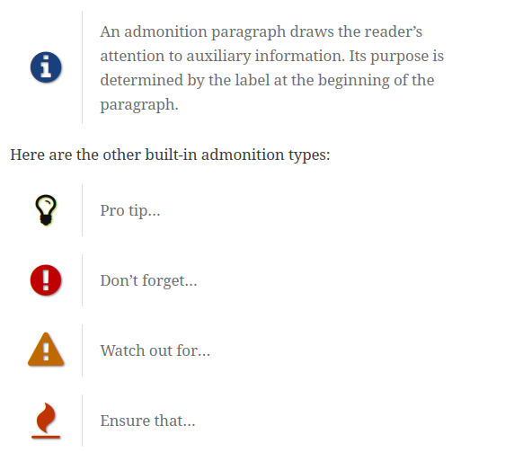
If you are familiar with Asciidoctor, you probably know that you can enable font-based icons using :icons: font.
When you do that, Asciidoctor will draw an icon for the built-in admonition labels.
And here’s the result with the default stylesheet:
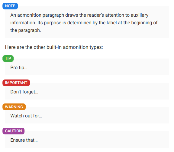
It might come as a surprise, but the Antora’s default UI uses its own stylesheet and does not include an icon font.
So, using :icons: font will not produce the desired affect:
Luckily, with a few lines of CSS, we can add the icons back to the admonitions labels.
Supplemental files
Antora provides a feature called "supplemental files" to supercharge the UI.
As you can see below, we can define a key named supplemental_files that points to a directory named supplemental-ui:
ui:
  bundle:
    url: 'https://gitlab.com/antora/antora-ui-default/-/jobs/artifacts/master/raw/build/ui-bundle.zip?job=bundle-stable'
    snapshot: true
  supplemental_files: './supplemental-ui'
In this directory we will create a CSS file:
.doc .admonitionblock .icon {
border-radius: 1rem;
}
i.fa[class^='icon-'],
i.fa[class*=' icon-']::before {
content: "";
height: 1.25rem;
width: 1.25rem;
margin-right: 0.25rem;
margin-left: -0.5rem;
}
i.fa.icon-note::before {
background: no-repeat url("../img/note.svg");
}
i.fa.icon-tip::before {
background: no-repeat url("../img/tip.svg");
}
i.fa.icon-important::before {
background: no-repeat url("../img/important.svg");
}
i.fa.icon-warning::before {
background: no-repeat url("../img/warning.svg");
}
i.fa.icon-caution::before {
background: no-repeat url("../img/caution.svg");
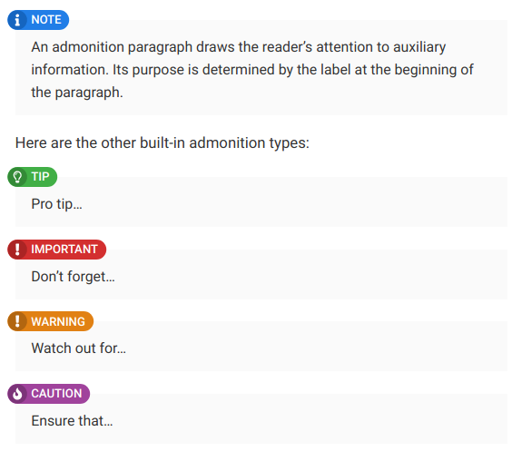
}Then, create a directory named img in the supplemental-ui directory and add the following SVG icons:
The circular background behind the icons is black with transparency so you can change the background colour of the admonitions without having to update the SVG files. Thanks to @streetster for the idea!
Now, we need to reference this new extra.css file in the <head> of our documentation site by creating a template named head-meta.hbs in a partials directory:
<link rel="stylesheet" href="{{uiRootPath}}/css/extra.css">To sum up, your supplemental-ui directory should contain the following files and directories:
supplemental-ui
├── css
│   └── extra.css
├── img
│   ├── caution.svg
│   ├── important.svg
│   ├── note.svg
│   ├── tip.svg
│   └── warning.svg
└── partials
    └── head-meta.hbs

3 directories, 7 file
And here’s the result:
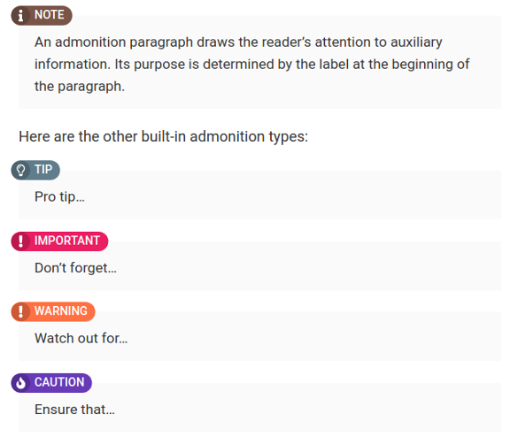
Since we are using a background with transparency, we can use alternative colors:
.doc .admonitionblock.note .icon {
    background-color: #795548;
}

.doc .admonitionblock.tip .icon {
    background-color: #607D8B;
}

.doc .admonitionblock.important .icon {
    background-color: #E91E63;
}

.doc .admonitionblock.warning .icon {
    background-color: #FF7043;
}

.doc .admonitionblock.caution .icon {
    background-color: #673AB7;
}
And here’s the result:
Here, we’ve demonstrated how to add icons next to the admonition labels but you can virtually override the style of any elements by adding CSS rules 🎨